User Experience & Interaction Design
Work
Contact
Personal MADE Icon
My personalized rendering of the YSDN MADE logo

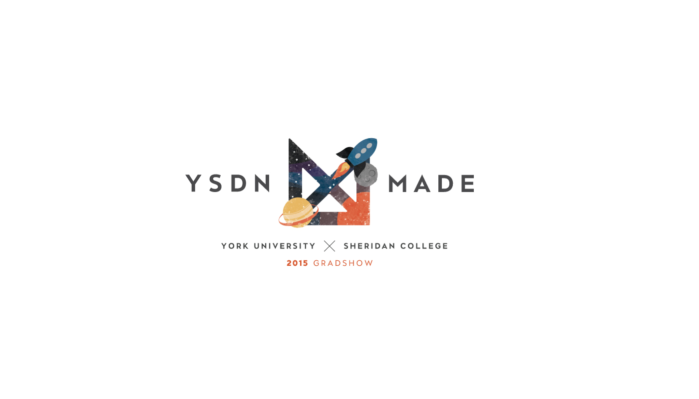
The name of the 2015 YSDN grad show was YSDN MADE. The name and theme of MADE highlighted each individual designer's creative process. Each graduate was tasked with designing their own version of the YSDN MADE logo, and the student logos would be displayed across all promotional material and in collages throughout the grad show itself. The parameters for each logo were simple: to follow the same basic shape, and to use the brand colour of red somewhere in the design.
I designed my logo to highlight my spirit of exploration and discovery through the process of design. Design is all about constant improvement and discovering new, unique and intuitive ways to engage users with meaningful content. Space exploration is an accurate metaphor for the vast potential of good design.
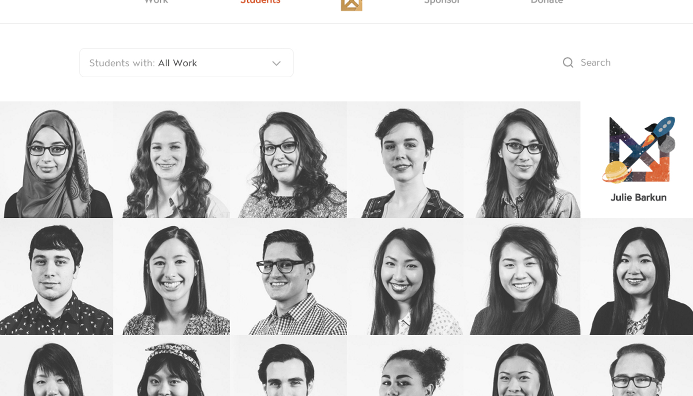
YSDN MADE Digital Portfolio Display
An iPad experience highlighting the digital portfolios of YSDN 2015 graduates.
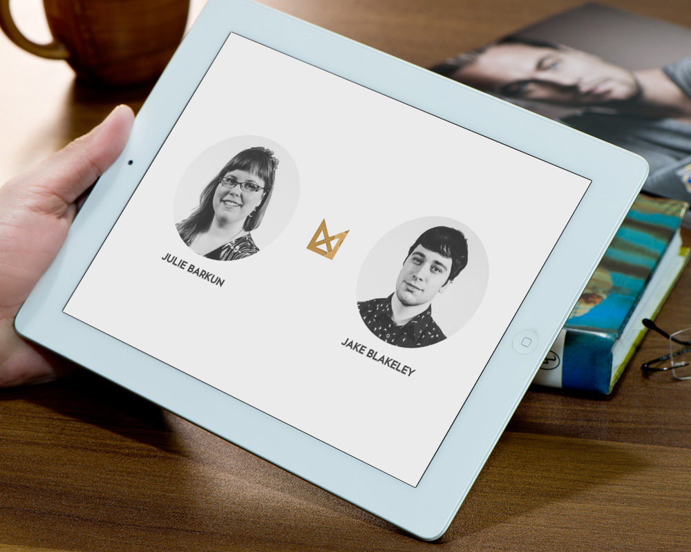
As part of the Interface team for the YSDN MADE grad show, I was tasked with designing an interface for the iPad to display each graduate's digital portfolio on the night of the show. Each iPad would be shared by two graduates, and would be on a stand between their booths. There were many factors to consider while designing the interface: it had to fit a wide variety of work and formats, and be easy to implement the night of the show. One of the major obstacles was how the interfaces would be filled with graduate information and work: the Interface team needed enough time to input the work of over 100 graduates, while the graduates needed enough time to submit their work, especially if they wanted to include work from their final year.
The solution was to build the interface with Wordpress, using the same database as the Web team. This allowed graduates to upload their work up until the last couple of weeks not only for the YSDN MADE website, but for their iPad displays as well. Each graduate was allowed up to three projects on the iPad, and a short description about their creative process. As with all other material for the show, each student was matched to their personal MADE logo. On the day of the show, a simple URL query would display the proper student for each iPad display.
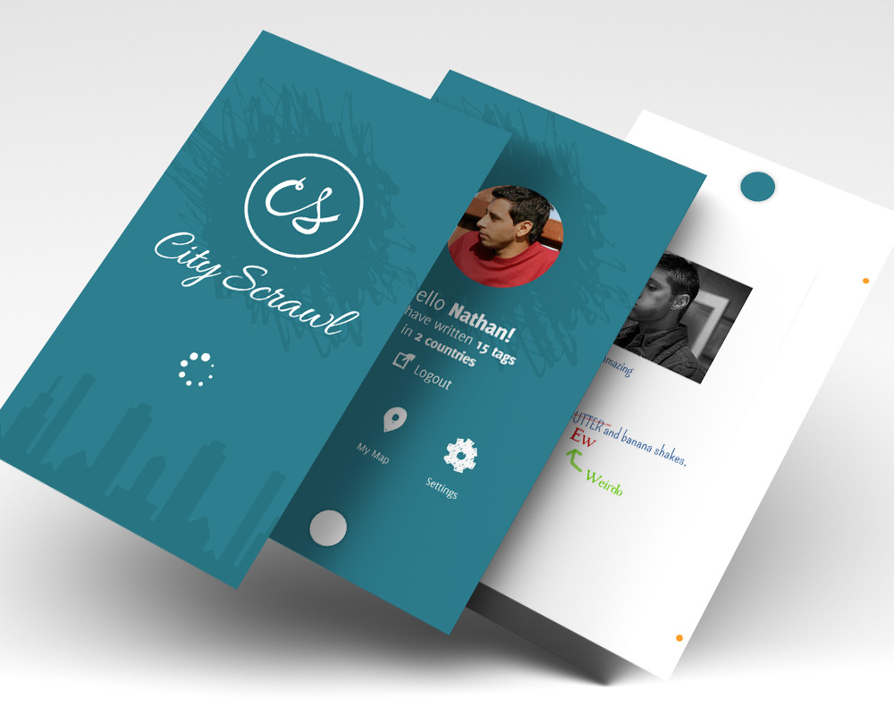
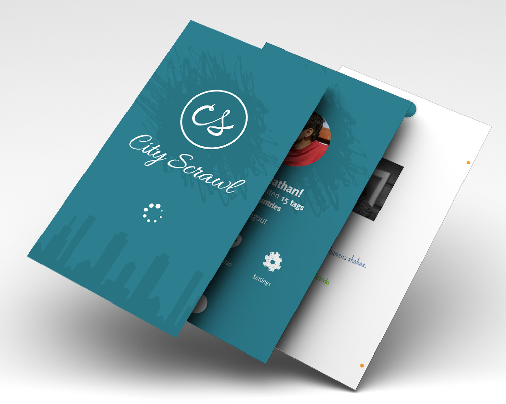
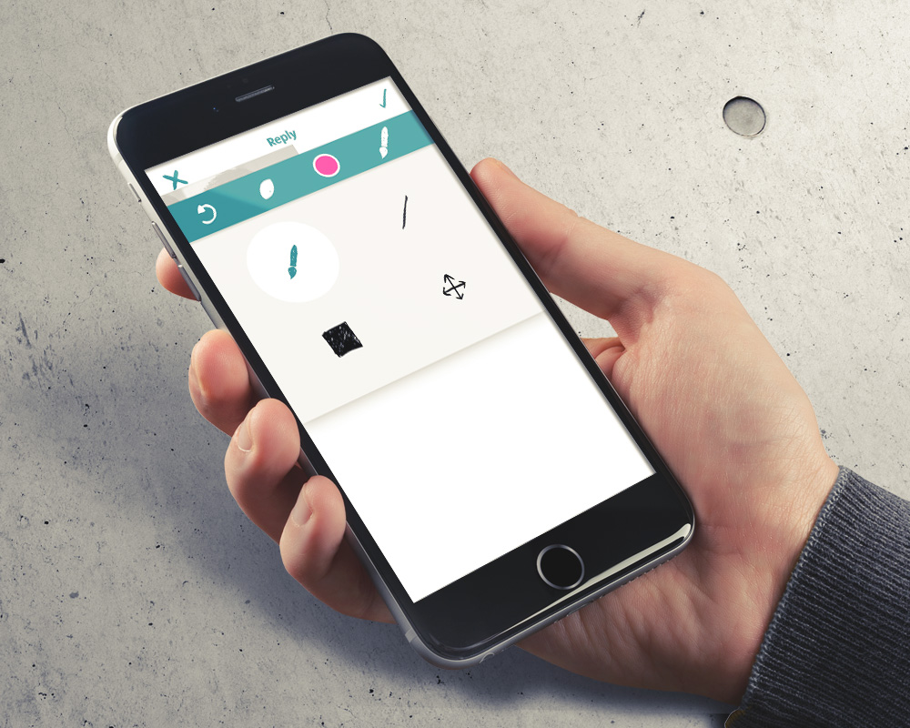
City Scrawl
A localized, collaborative whiteboard app.
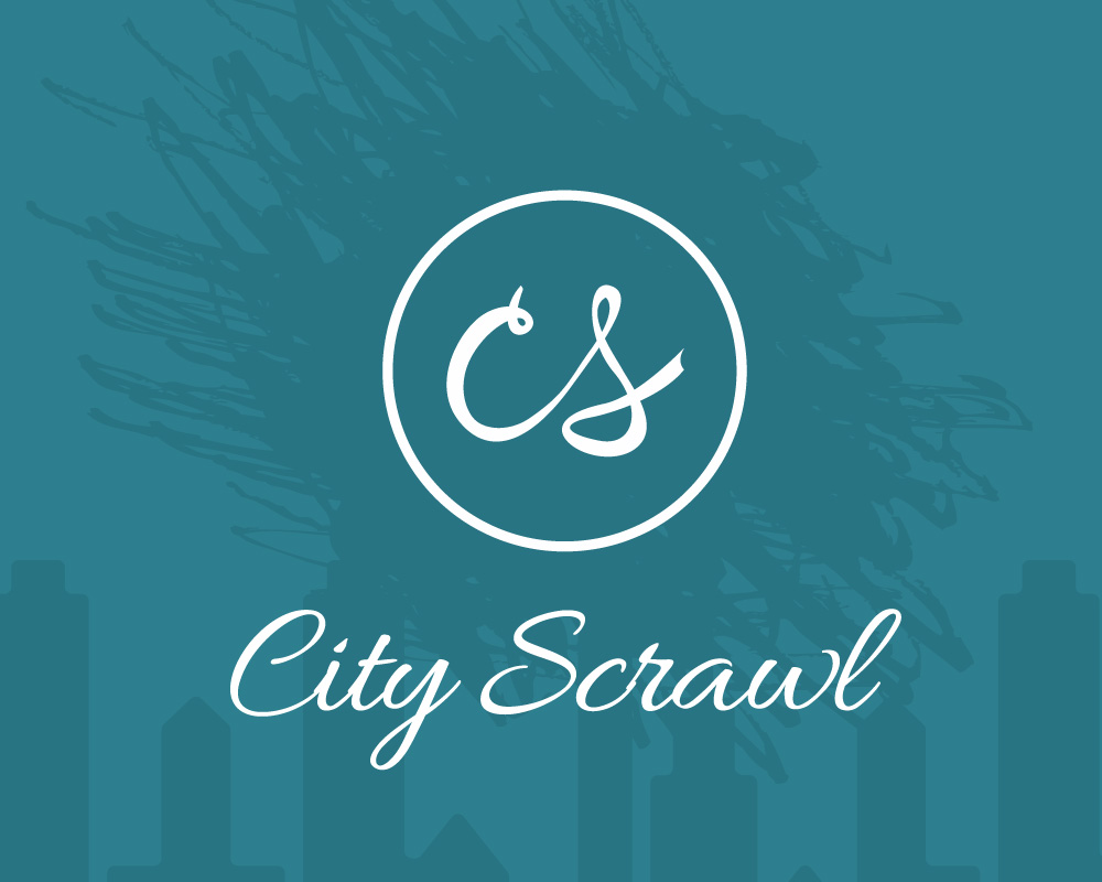
An issue I tackled for a school project was graffiti and vandalism as both a crime and a creative outlet. There is an undeniable attraction to scribbling your name on a park bench or a message in a bathroom stall, and the 'conversations' that occur anonymously can be uplifting, infuriating, entertaining or completely hysterical. Yet graffiti is still a crime, so I challenged myself to come up with an alternative.
City Scrawls is a mock iPhone app enabling users to leave messages, images, drawings and videos in a virtual space (board) tied to a physical location through GPS. The messages you leave are completely anonymous, and the only reason you would even log into the app is to track your messages for responses. Just like with physical graffiti, other users can respond to you or even write on top of your message.
There are two keys to the City Scrawls experience: anonymity, and location-lock. By limiting users to only interact with the 'board' tied to their current location, City Scrawls retains the idea that to interact with the 'graffiti', you must be physically present. Each 'board' is limitless, offering an endless canvas for users to contribute to over time.
Black Creek Pioneer Village
Attracting visitors with an engaging and informative app.
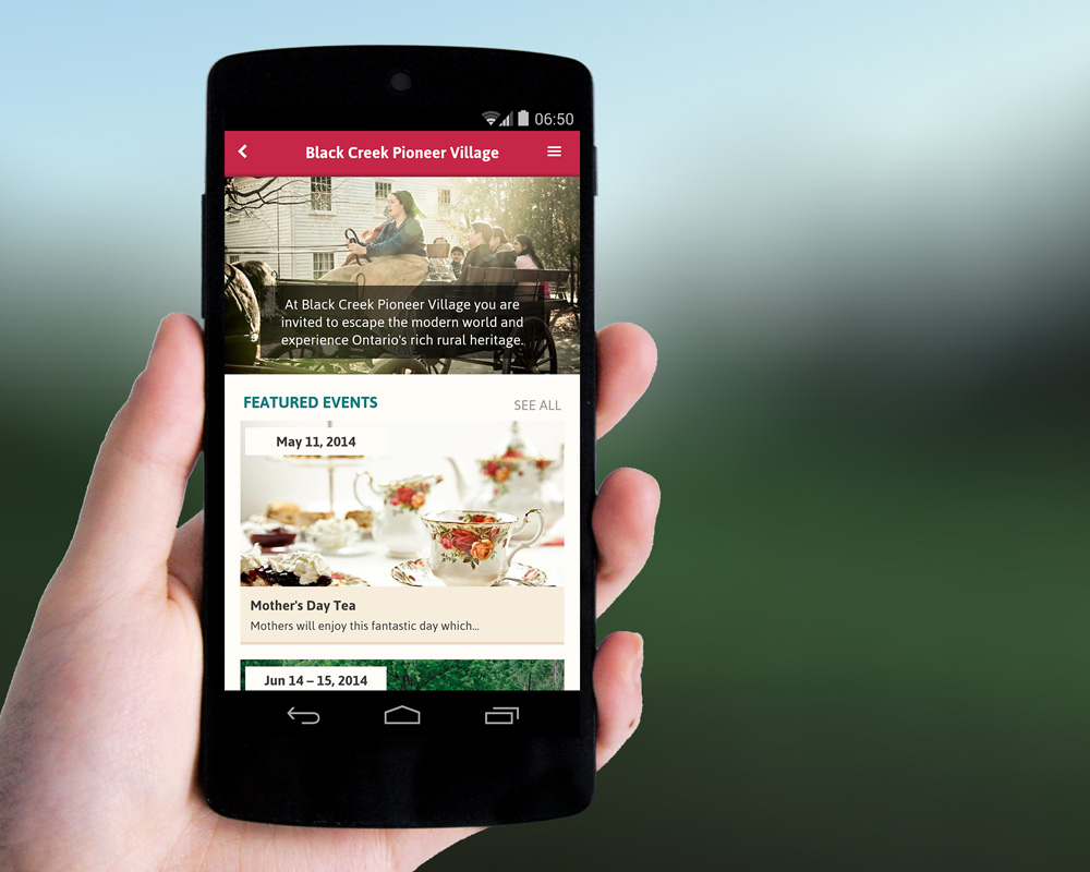
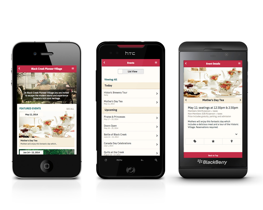
Black Creek Pioneer Village is a living museum inviting visitors to travel back in time and experience a typical Toronto-area village during the 1800's. Like most other pioneer villages, it's main audience consists of school groups and families with young children. But there are activities in the Village better suited for young adults, such as brewery tours. These events are underrepresented, and word wasn't getting out to their target audience that there were activities in the Village for more than just children.
In a team with fellow designers Yanchao Hao, Candice Lin and Dana Dinh, we prototyped the Black Creek Pioneer Village app. The cross-browser compatible app tackles this issue by making event information readily available to anyone with a smart phone, rather than dig through the layers of information on the Village's current website. Events can be marked as 'featured' to draw attention, and potential visitors can book an activity straight from the web app.
Another challenge faced by the Village was visitor retention: how to ensure visitors returned. Our proposed solution was an interactive quiz that challenged visitors on the knowledge they gained from visiting the Village. Completing the quiz earns the user a small discount on their next visit. They can also share their quiz results through Facebook and Twitter either for bragging rights or to challenge their friends to do better.
Where Did The Money Go?
Comparing data on 2010 political contributions and election results.
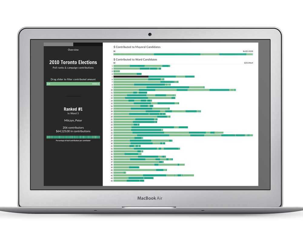
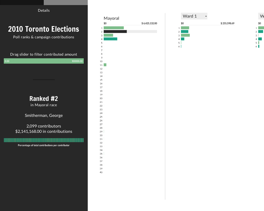
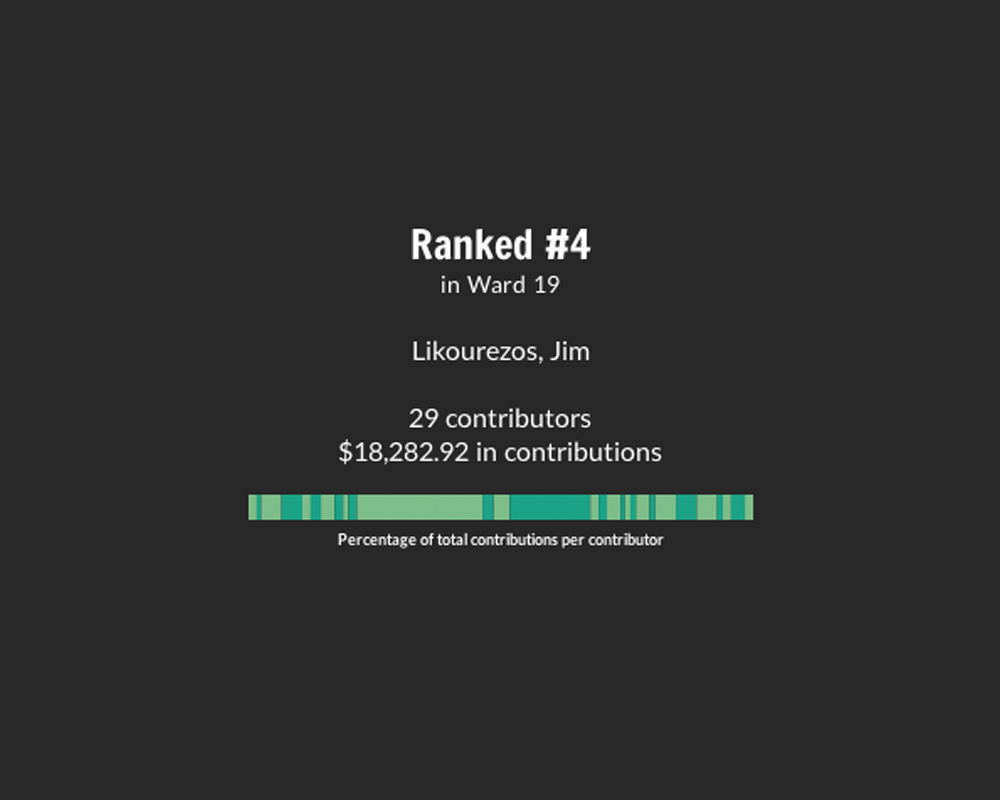
The objective of this data visualization was to compare the vast amounts of data on the 2010 Toronto Elections poll rankings for both the Mayoral and Ward races, and compare it to the campaign contributions each canditate received throughout the race. Both sets of data were pulled from Open Data Toronto, and plugged into a visualization coded in Processing, a Java-based language used mostly for generative design and data visualization. Each dataset contained thousands of table rows, making a programming language necessary to accurately calculate and generate results.
Going into the project, I did have some preconceived notions about what the correlation between poll ranking and contributed money would be, but the final results once generated were very surprising. A user can navigate through the visualization and see where each candidate placed in their respective race by their position on an icicle chart, with the length of their bar representing the money they collected. Two separate views of the data make it easy to view an overall picture or filter down ward by ward.
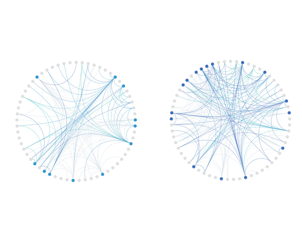
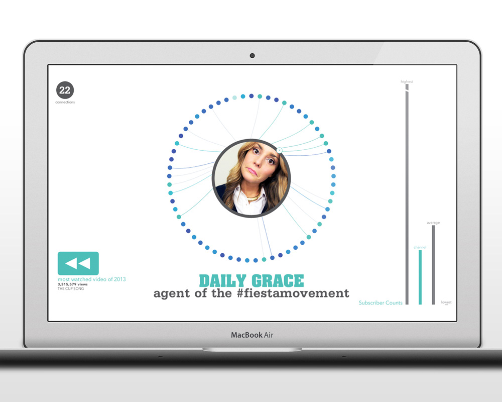
Youtube Rewind 2013
Visualizing 61 Youtuber and viral personality connections across a collaborative video.
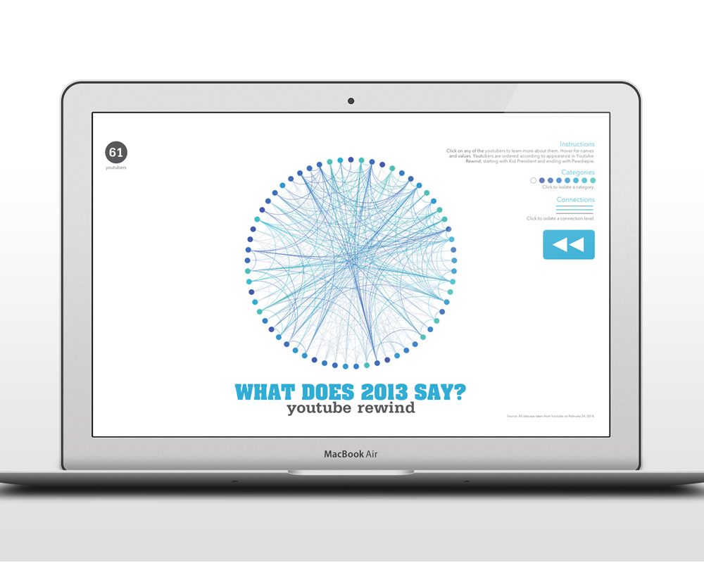
This project was a self-issued challenge and experiment with Processing, a programming language based in Java and used for generative design and data visualization, among other things. While familiar with beginner's level Processing code, this was my first attempt at both a more advanced application and integrating data from an outside source. All data is stored in an XML file, and can be swapped out with a different set of data for a new visualization.
This application celebrates the expansive, connected world of Youtubers by mapping out who knows who among the 61 personalities who participated in the 'What does 2013 Say' Youtube Rewind collaboration video. Data was pulled from each Youtuber's channel (or channels, as the case was for many of them) on their subscriber counts, most popular videos, and who they have collaborated with. Youtubers were further organized according to when in Youtube Rewind they first appeared, and sorted into categories based off their primary video content (vlogging, games, cooking, etc).
When the application is run, the lines drawn between connected Youtubers reveal interesting results, such as a visual representation of when the video's dance break occured and how vloggers tended to interact mostly amongst themselves rather than the other genre categories.
The Banff Centre Fast Facts
A printed infographic highlighting the Banff Centre's accomplishments
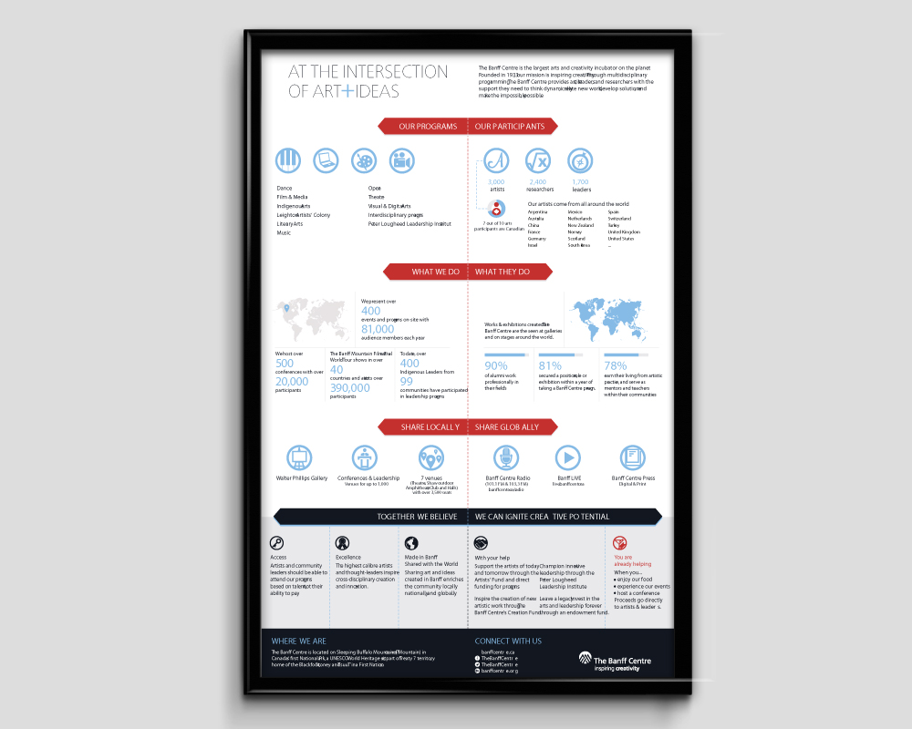
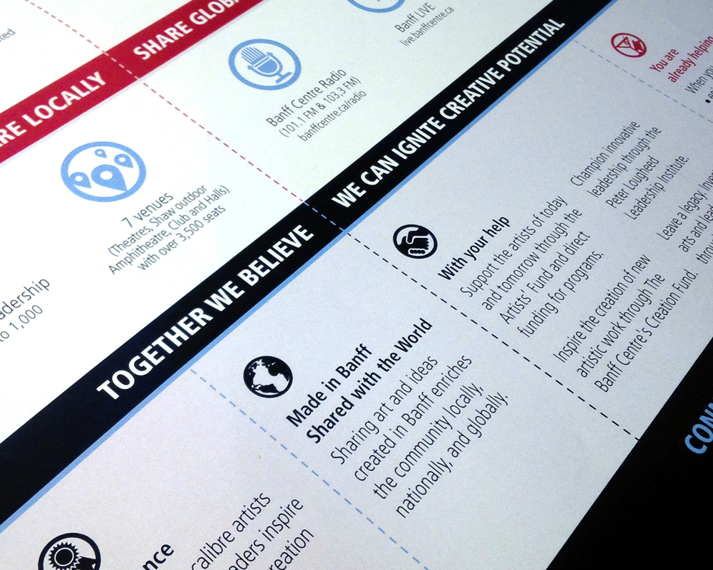
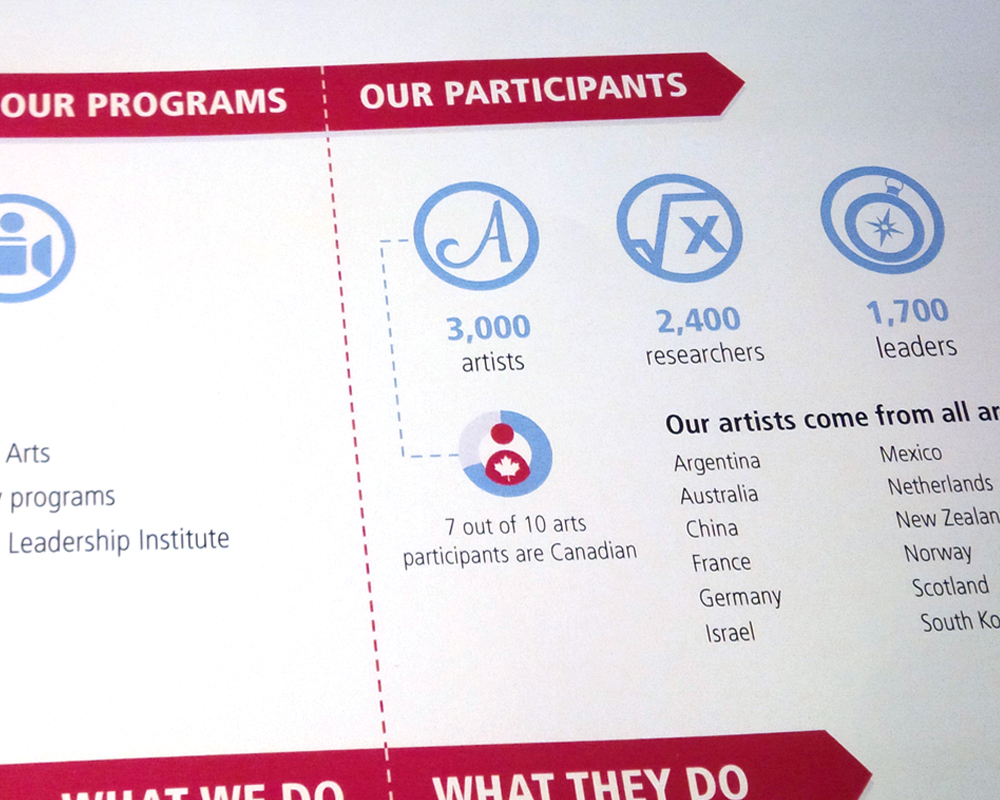
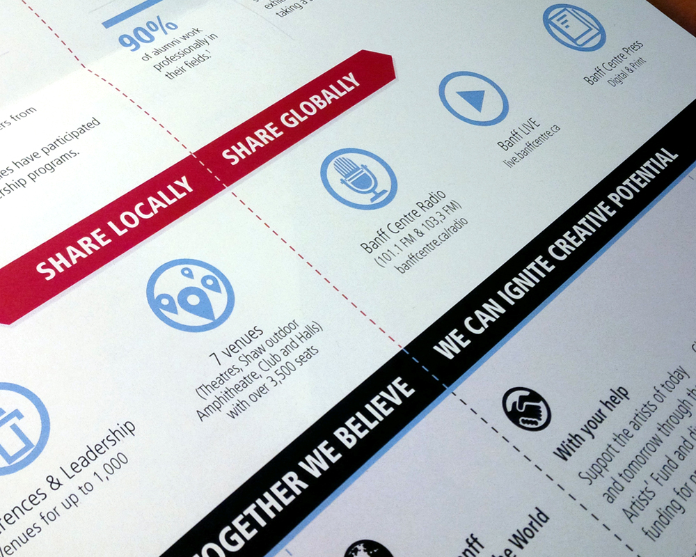
While working at The Banff Centre as their summer intern, I was approached by the Marketing & Communications team lead with a challenge: to redesign their current text-based Fast Facts sheet into a more easily-digestible, engaging information graphic. The Fast Facts sheet is used to communicate Banff Centre stats on program participants, events held, alumni and more. It is an important piece used when describing The Banff Centre to the media, new staff and donors.
As The Banff Centre had never created an infographic before, I was in the unique position of working with the Marketing & Communications team entirely from scratch in producing and delivering an engaging experience. The final piece is divided in two, contrasting what is offered at The Banff Centre and what those who've participated in it's programs have gone on to do in their various fields. Because the Fast Facts is used to solicit potential donors, it's main goal is to communicate at a glance why The Banff Centre is an institution worth investing in.
The Fast Facts information graphic saw it's first distribution during the 2014 Midsummer Ball Weekend. It is also made available to new staff members during orientation.